ICF & Welko restyles its logo and website
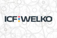
ICF & Welko, a historic Maranello-based company which builds industrial plants for numerous application sectors, has completed a rebranding and visual identity upgrade project. The aim is to communicate the dynamism of the group and the structural reorganisation programme it is currently pursuing regarding its international market presence.
The new logo sums up the brand values by bringing together the two parts of the name created following the 2007 merger between ICF and Welko. The new brand design also includes three coloured dots in the company’s historic colours symbolising its three business units: red for the food sector, blue for ceramics and yellow for cookware.
Each of these operating units, which can be extended to the chemicals, pharmaceuticals and agricultural sectors, has its own autonomous operational and commercial structure integrated upstream into a single group offering shared experience, logistics and research.
The company’s website has also been restyled graphically and in terms of navigation and now offers many new functions, including the possibility of requesting a customised quote.
Did you find this article useful?
Join the CWW community to receive the most important news from the global ceramic industry every two weeks


